Choosing cabinet colors is one of the highest-impact decisions in a kitchen renovation, they consume 30–40% of the visual real estate, set the mood for the entire space, and stick around for years. Whether you’re planning a full remodel or just considering a cabinet refresh with paint or stain, the color combination you pick makes or breaks the room. This guide walks through 15 proven kitchen cabinet color combinations that work in real homes, from two-tone classics to bold statement palettes. You’ll see why certain pairings feel timeless, how to balance color without overwhelming a small kitchen, and how to tie cabinets to countertops and backsplash so everything feels intentional rather than thrown together.
Table of Contents
ToggleKey Takeaways
- Kitchen cabinet color combinations account for 30–40% of visual impact, making color selection crucial for setting the mood and longevity of your kitchen design.
- Two-tone cabinet pairings (one color on upper, another on lower) are the most forgiving approach for DIYers and remain the dominant residential kitchen trend.
- White and wood, dark and light contrast, and greige (gray-beige) are proven kitchen cabinet color combinations that work across different lighting conditions and design styles.
- Bold jewel-tone cabinets work best in kitchens with good natural light and pair beautifully with warm metals like brass and copper hardware for an upscale, intentional look.
- Test cabinet paint samples, countertop materials, and backsplash tiles together under your actual kitchen lighting for 24 hours before committing to avoid costly design mismatches.
- Small kitchens benefit from either very light cabinets to maximize perceived space or one bold color paired with minimal, simple elements to create intentional, curated designs.
Classic Two-Tone Combinations
Two-tone cabinetry, pairing one color on upper cabinets and another on lower, is the most forgiving approach for DIYers and remains the dominant trend in residential kitchens. It creates visual interest without requiring perfect cohesion across the entire kitchen. Two-tone also masks dust and fingerprints better than single-color schemes, and it breaks up the visual weight of a kitchen, especially in tighter spaces.
White and Wood Pairings
White uppers with natural wood lowers (or vice versa) hit the sweet spot between modern and timeless. White cabinets bounce light and open up a kitchen, while warm wood tones anchor the space and add texture. This pairing works because white is a neutral reset, letting the wood grain be the standout feature, you don’t fight competing colors.
If you’re painting existing cabinets white, prep is non-negotiable: sand with 120-grit sandpaper, prime with a quality shellac or alkyd primer (oil-based primers grip slick cabinet surfaces better than latex), then apply two coats of semi-gloss or satin cabinet paint. Semi-gloss is more durable and wipes clean: satin is slightly more forgiving if brush marks appear. Expect to spend $400–$800 for paint and primer for a typical kitchen, depending on cabinet count and whether you hire labor.
For the wood lower cabinets, a clear matte or satin polyurethane topcoat protects the grain without darkening it significantly. If your wood is already stained and you want to lighten it, whitewashing (diluted white paint over stain) adds a coastal, rustic feel without full coverage.
Dark and Light Contrast
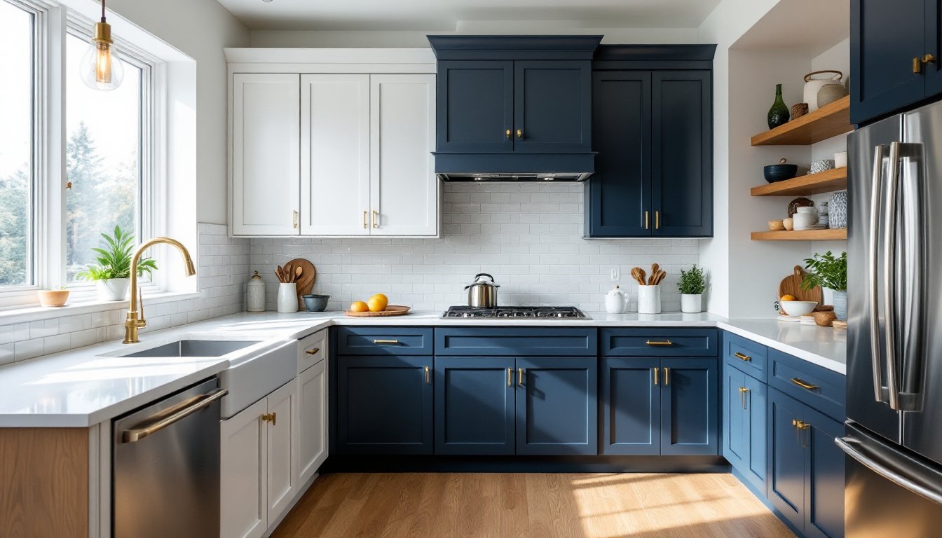
Dark lowers paired with light uppers (navy, charcoal, or black on bottom: white, cream, or light gray on top) is the inverse of the wood-and-white combo and feels more contemporary. The dark color grounds the kitchen visually, so heavy-looking lower cabinets don’t feel as imposing because the eye rests on brighter uppers. This scheme works particularly well in kitchens with limited natural light, the light uppers reflect what light exists.
Be aware: dark cabinet paint shows dust, water spots, and fingerprints far more than light colors. If you go dark, choose a satin or semi-gloss finish (glossy finishes look like plastic: flat finishes hide dust but are harder to clean). Expect to wipe down dark lowers weekly if you have kids or pets. Navy is more forgiving than pure black because it absorbs less light and reads less sterile.
One practical tip: if you’re unsure about committing to dark, start with a sample board. Paint a cabinet door or a sheet of plywood with your color and finish choice, hang it in the kitchen for 48 hours, and observe it in morning light, afternoon light, and under your current kitchen lighting. Samples in the store look nothing like how the color performs on your walls and cabinets.
Neutral and Earth-Tone Schemes
Neutral cabinets, greige (gray-beige), warm gray, soft taupe, or creamy off-white, create a sophisticated, unfussy backdrop for changing decor over time. They’re the wallflower in the room: visually calm and endlessly versatile. Earth tones (warm caramels, sage green, terracotta undertones) add subtle color without the risk of a bold color feeling dated in five years.
Greige is the current sweet spot because it reads warm in golden light and cool in daylight, the color adapts to your kitchen’s light exposure rather than fighting it. If your kitchen gets lots of south-facing sun, a true cool gray can feel cold: greige stays inviting. Popular greige shades like Benjamin Moore’s Accessible Beige or Sherwin-Williams’ Urbane Bronze (yes, it’s marketed as a dark gray, but it reads brownish-gray in most light) have staying power because they’re barely colors, they’re the visual equivalent of a neutral linen backdrop.
Sage green and muted olive have resurged as millennial and Gen-Z homeowners push back against pure white kitchens. These colors feel fresh without screaming “trend,” especially paired with brass hardware and marble countertops. The key is choosing a desaturated version (think dusty, not bright kelly green) so it reads sophisticated instead of campy.
When you’re painting neutral tones, buy a sample quart and paint a large poster board, then hang it above your countertop for a full day. Neutral colors are deceptive, what looks warm in the store can read gray or purple in your actual kitchen depending on undertones and lighting. Paint brands don’t list undertones clearly (they hide them in names like “accessible” or “urbane”), so the poster board test saves expensive rework.
Bold and Statement Color Ideas
If you’re confident in your taste and willing to embrace color, bold cabinet palettes, emerald, deep forest green, warm burgundy, charcoal with jewel-tone accents, make kitchens unforgettable. These combos work best in kitchens with good natural light, because bold colors absorb light and can make spaces feel smaller or cave-like if lighting is poor.
Deep jewel tones (emerald, sapphire, rich teal) pair beautifully with warm metals, brass, copper, or warm gold hardware, and natural wood accents. This combination reads upscale and collected rather than trendy. Paint-wise, you’ll need the same prep as any cabinet paint job: sand, prime, two coats of quality cabinet paint. Expect 3–4 coats on bold colors because dark paints often need extra coverage for even color.
A practical middle ground: commit bold color to lower cabinets only and keep uppers light or neutral. You get the impact without the visual weight filling the entire kitchen. Or, go bold on an island and keep perimeter cabinets neutral. Islands are low-stakes because they don’t set the tone for the whole room.
Matt Hutchinson, a designer featured on Houzz’s cabinet color palette guide, recommends bold colors as accent walls in kitchen cabinetry, you’re already committing to a kitchen project, so a dramatic color feels intentional rather than impulsive. If you’re nervous, repaint is possible but labor-intensive: primer and paint removal are messy and time-consuming on cabinets.
Small Kitchen Color Solutions
Small kitchens demand color strategy. White or very light cabinets open the space visually and reflect light, making 80 square feet feel less cramped. The downside: they show every smudge and require obsessive cleaning. If you’re willing to stay on top of cleaning, light cabinets are your best bet for perceived spaciousness.
Alternative strategy: use one bold or dark color and keep everything else minimal. A small galley kitchen with deep blue or forest green cabinets feels intentional and curated if walls are white, countertops are simple, and hardware is restrained. You’re leaning into the compactness rather than fighting it.
Vertical visual lines help too. Tall, narrow cabinet doors (or tall stiles within cabinet frames) draw the eye upward, making ceilings feel higher. If you’re replacing cabinet doors, prioritize tall proportions over wide ones. Hardware placement matters: handles centered vertically on tall doors elongate the space: handles low on base cabinets and high on wall cabinets also encourage the eye to move up.
Avoiding busy patterns and sticking to solid colors (no two-tone on every door) prevents visual chaos in tight spaces. One or two accent colors maximum. Remodelista’s kitchen remodel guides include countless small-space solutions that prioritize clarity and proportion, worth reviewing if you’re working with under 100 square feet.
Matching Cabinets With Countertops and Backsplash
Cabinet color is 40% of the equation: countertops and backsplash make up the remaining visual weight. A mismatch here tanks the whole design.
White cabinets pair seamlessly with almost every countertop and backsplash because white is a neutral reset. White cabinets with black countertops and white subway tile is timeless. White cabinets with marble, quartz, or granite (any color) work because the eye focuses on countertop pattern rather than cabinet color.
Dark cabinets (navy, charcoal, black) need light countertops for balance. Pair them with white quartz, light gray laminate, butcher block, or light marble. Dark cabinets with dark countertops absorb all light and feel heavy. Light backsplash also matters, white subway tile, light gray, or simple neutral keeps the kitchen from feeling like a cave.
Warm wood cabinets suit earth-tone countertops (beige quartz, warm gray, honey-colored granite) and white or cream backsplash. Wood cabinets with white subway tile and stainless steel hardware is a proven classic. Avoid light gray countertops with warm wood: the mismatch between warm and cool tones creates visual tension.
Greige or warm gray cabinets are the chameleons, they work with almost everything because they’re barely a color. Pair them with any countertop that isn’t competing in saturation (avoid bold jewel-tone countertops unless you’re deliberately going maximalist). White, light gray, cream, and soft marble backsplashes all harmonize.
Jewel-tone cabinets (emerald, sapphire, burgundy) need warm, light countertops and simple backsplash. Pair emerald with warm white quartz or light marble and simple brass fixtures. The cabinets carry color weight, so countertops and backsplash should stay neutral. Brass hardware ties jewel tones together because metals warm up the palette.
House Beautiful’s paint color guides include room makeovers that detail countertop and backsplash selections paired with cabinet colors, study these before ordering materials. Seeing combinations in finished kitchens beats abstract color theory every time.
Practical tip: order samples of cabinet paint, countertop material, and backsplash tile simultaneously and lay them side by side under your actual kitchen lighting (not the store’s fluorescents). Live with the combo for 24 hours. Countertop samples are usually free: cabinet paint sample quarts cost $6–$10: backsplash tile samples cost $2–$5 each. Spending $30 on samples beats a $5,000 countertop mistake.